In ultra-competitive markets, retail stores are making use of all the tools at their disposal. Customers must be enticed and having the perfect store signs is an essential part of the luring strategy.
The perfect store sign message must be simple and visual
Here are 5 tips for designing the perfect commercial signs for your establishment. Remember, there’s no right answer, only the answer that’s right for you.
Unique – This must be the first question you ask and again the last question you ask yourself in your sign design process. Is the sign unique; does it stand out from your competitors’ signs? Whether by use of color, style or physical design, make sure your sign stands out.
Example: The iconic Apple sign. Is it considered half an apple? Doesn’t matter, it’s unique and people desire it.
Simple – Customers and passersby see commercial signs as guides, not information boards. Also, since signs are viewed from a distance, intricate details are not even noticed. Remember, signage must be recognizable even in your peripheral vision. Too many colors, too much text will just blend into the background.
Example: Red Cross. A supremely simple sign that is recognized around the world. Just demonstrates that signs are embodiments of brand value, not the other way around.
Specific – Be certain in your messaging. Think of your store signs as almost wayfinding boards. Too many elements or words will confuse the message. Try and keep each sign limited to just one logo or business name. Just think, how simply Starbucks advertises its stores.
Example: GE (General Electric), A company that only has a few letters as their sign. If you offer a lot of diversified products or services, keep your brand and commercial signs simple. Try to advertise everything and your signs will convey nothing.
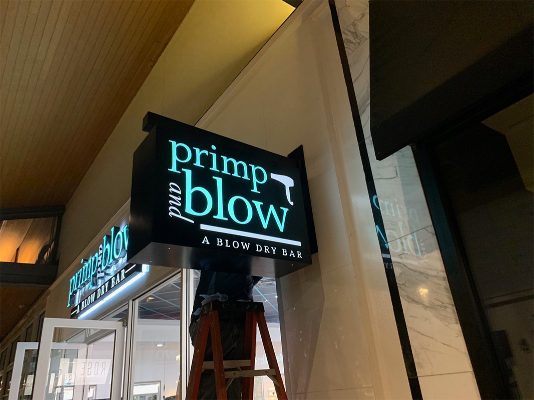
Light up – For the ultimate sign, lights are an absolute must. No, it’s not enough to just have a backlit sign or spotlights pointed right at it. LED lights or neon must be incorporated directly into the design. Channel letters are a great example of how you can use light effectively.
Example: ‘Open’. You’ve seen this blue and red sign in so many store windows. What a simple and fantastic tool for creating urgency and driving business – especially towards closing time. Well-lit signs are more noticeable.
3-dimensional – So many business owners forget that signs don’t have to be created on flat sheets of steel or plastic. 3-dimensional lettering and signage that is installed perpendicular to your building are essential for standing out.
Example: Starbucks. A simple circular sign that protrudes from the side of the building. You see it from afar and there’s no mistaking the distinctive coloring and logo. After all, your customers walk looking ahead, not with their heads cantered over at a 90-degree angle.
Make these tips your mantra and you will be on your way to getting a great sign. Contact us today to begin the process of creating your next perfect store sign!